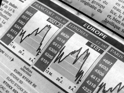
It is undeniable that knowing how to assess forex charts is the key to success. After all, it is the only means through which upcoming opportunities could be accurately identified. It should be pointed out however, that taking full advantage of such graphical tools requires sufficient knowledge of the unique features of each chart type. Indeed, while line, bar, and candlestick graphs do have similarities, it would be appropriate to say that they differ in terms of the information that they provide. To learn more about the differences among chart types, it would be necessary to read on.
The simplest of forex charts is arguably the line graph. Essentially, such a kind of chart represents fluctuations from one closing price to another. It should be emphasized though, that despite being uncomplicated, the above mentioned graph is generally considered a necessity by many of those experienced in currency-exchange pursuits. While this might seem surprising to novice traders, one should never overlook the fact that the closing price is among the most important pieces of information to focus on when attempting to identify the trend of a currency pair’s price, whether throughout a period of a week, a month, or even a year.
As one might expect, the bar chart contains more information than the line graph. It would be best to keep in mind however, that even though the bar graph features details regarding the closing price much like other forex charts, it is most commonly used for analyzing the highs and lows in a given period. To explain further, it is composed of vertical lines that each reflects the market’s condition at a specific point in time. Of course, the upper tip of the line pertains to the highest price, while the bottommost portion represents the lowest value.
The candlestick chart is perceived by some as merely an aesthetically enhanced bar graph. In truth, even the slightest differences have the potential to bring forth noteworthy improvements. In particular, unlike the forex charts mentioned above, the candlestick graph is quite eye-catching as it is made up of colored blocks: green ones indicate an instance in which the closing price exceeds the opening price, while the red ones symbolize the opposite scenario. Since there are those who would point out that bar graphs are sometimes color-coded as well, one should remember that blocks are easier to see than lines.
As made clear, there are three main types of currency charts. To reiterate, the line graph is the simplest of charts and thus it is only used for identifying patterns in closing prices. On the other hand, the bar graph is a much more detailed visual tool than the previously mentioned chart as it reflects data pertaining to the highs and lows of a specific trading period. Of course, the candlestick chart is an improved version of the bar graph in terms of both aesthetic appeal and functionality. All in all, it cannot be denied that forex charts do differ with one another in more than a few ways.


Comments are closed.