It cannot be denied that complete beginners in currency trading find it difficult to learn about the various kinds of forex charts. After all, just by glancing upon such graphical representations of data, novices would surely be confused as to what each line and color means. Indeed, even though it is obvious that every chart contains important information regarding the latest trends in the currency market, there are still differences between each variant. In this sense, instead of staring at charts in an attempt to finally discover their secrets, it would be much more advantageous to continue reading this article.
As many have realized firsthand, the simplest forex charts are those that are merely comprised of lines. Commonly referred to as line charts, such graphical tools make it possible for any trader to evaluate the fluctuations in a currency pair’s value throughout a specific period of time. As a matter of fact, due to the sheer flexibility of the abovementioned type of chart, it becomes possible to observe hourly, daily, weekly, monthly, and even yearly trends. Nevertheless, some would point out that simple line charts would not be enough in some currency-exchange activities.
Indeed, it is true that those rather experienced in trading endeavors have to rely on much more complex forex charts. It is for this very reason that quite a number of “expert” traders make use of bar charts instead of line charts. To put it simply, bar charts provides information regarding the highs and lows of a given trading period. Aside from this, bar charts also feature details about the open and close prices for each trading cycle and actually present such data in a “continuously connected” manner. With this in mind, it becomes clear that by looking at bar charts, it would be easy to distinguish the “bullish” from the “bearish”.
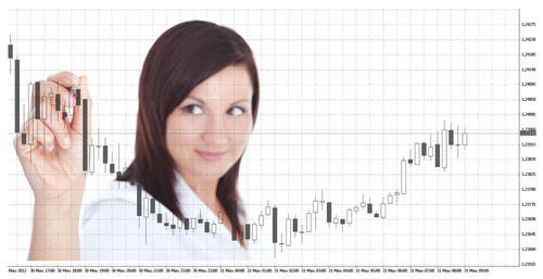
Of course, there is an alternative to bar-type forex charts: the candlestick chart. It should be emphasized however, that candlestick charts are not necessarily different from bar charts in terms of the information that they provide. After all, candlestick charts mainly contain four types of data: the high and low points as well as the open and close prices. Despite the sheer similarity between “bars” and “candlesticks” though, it is undeniable that the latter is much more aesthetically impressive and in a way much easier to evaluate due to the size of each “candlestick”.
As made clear, three common kinds of charts exist. To reiterate, the line chart remains as the simplest of chart variants, as they mainly provide insights about general trends in the currency market. On the other hand, the much more complex bar chart offers traders enough details about the various facets of a currency pair’s price. Of course, the candlestick chart is essentially the same as the bar chart except for the fact that data are presented in a more “visible” manner. All in all, it would definitely be appropriate to say that understanding the core differences between such forex charts is not difficult at all.


Comments are closed.