Choosing the right chart is an excellent place to start if you want to become a technical trader. Active traders can use a wide range of charts, from simple line charts to complicated point-and-figure charts.
So many options can paralyze market technicians who have yet to do it. You can learn more about the market by looking at the OHLC chart and candlestick plots.

Explain what an OHLC chart means.
One of the most standard types of charts today is the open high low, close (OHLC) chart. As the name suggests, each “price bar” shows the price at the beginning, the day’s high and low prices, and the price at the end.
As with any other type of technical indicator, there are pros and cons to using OHLC charts.
Pros
- Because it is so flexible, traders can use an OHLC chart in any market and at any time. The price bars themselves show how the market is doing. For example, bigger OHLC bars mean that the market is more volatile.
- OHLC plots can also be easier to understand with the help of color codes. Most of the time, bars that end up higher than they did at the start are colored green. And bars ending lower at the beginning can be colored red.
Cons
- If there is no shading, the price bands look the same. An OHLC indicator doesn’t tell much about how much a stock trades daily.
- If the bars are too small, you may need to look into the OHLC values more.
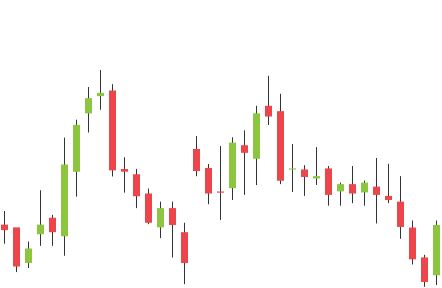
How do candlestick charts work?
Candlestick charts were first used at the Dojima Rice Exchange in the 1800s. Steve Nisson, a technician, taught traders in the West how to use candlesticks.
Their structure comprises a high and low wick and the body. The core consists of a set of dynamic starting and ending prices.
There are some pros and cons of using candlestick patterns:
Pros
- Pattern analysts love candlestick charts because they show a lot of detail. The wicks and bodies of each candle offer clearly how prices have changed, so trading ranges are easy to see.
- For the sake of simplicity, green candles show a positive trend (close > open), while red candles show a negative trend (open > close).
- Like OHLC charts, candlestick charts can be used in any market and at any time.
Cons
- It takes huge practice to be able to see patterns that are unique to each candle in real time.
- Candlestick charts look nice, which can lead traders to make wrong assumptions about patterns and trends.
Bottom line
There is no technical indicator, tool, or charting format that everyone agrees is better. Each one helps to explain how the market works differently. The specialized tool a trader prefers will depend on their trading style and plan.
On the other hand, you can exchange when the prices change. OHLC charts are easy to understand and might be what the doctor ordered. When choosing between OHLC bars and candlesticks, an essential thing to consider is how well each one meets your needs. Whether you have more success trading with candlesticks or OHLC bars depends on how you like to trade.